
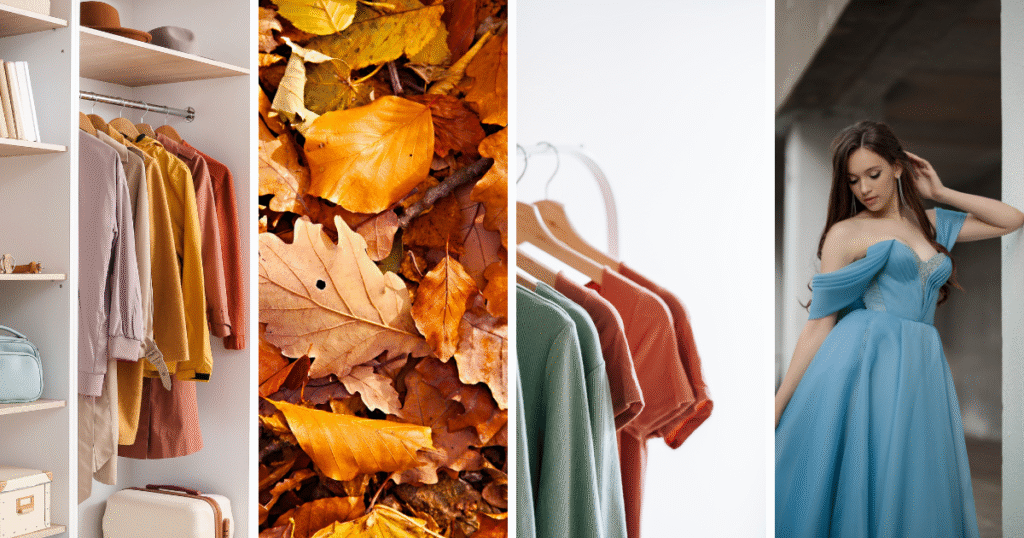
Fall never starts the same way for everyone. Some people wait until the air feels cooler. Others switch as soon as September begins, even if it is still hot outside. And some do not wait at all. They pull out fall color palettes in the middle of summer just because it feels good.
That is what makes fall shades special. They follow our feelings more than the date on the calendar. A caramel tone on the table makes dinner feel cozy, even as summer’s heat lingers. Burgundy in the closet feels right, whether you wear it with boots or with sandals. Terracotta in the living room gives a sense of warmth even before the leaves begin to change.
This guide shares fall color palettes with hex codes so you can bring the season into your home and wardrobe the way you want to.
The Best Fall Color Palettes to Try In 2025
Fall color palettes are not just pretty on a Pinterest board; they’re the shades that make your home feel warmer, your outfits look sharper, and your family photos instantly seasonal. Below are palettes with hex codes you can copy straight into your space or wardrobe, no guessing needed.
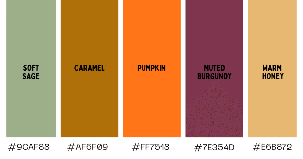
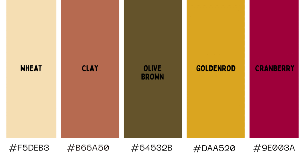
Classic Fall Color Palette
When people picture fall, this is usually the color palette that comes to mind. They work well mixed as a group or even on their own. Add one of them to your home or outfit, and the season feels like it has arrived, no matter what the weather outside is doing.


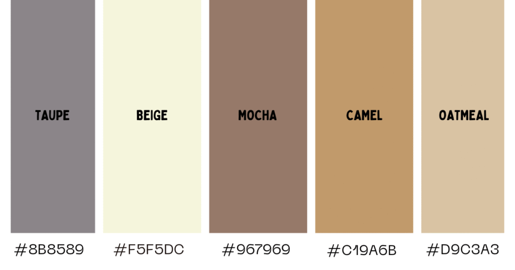
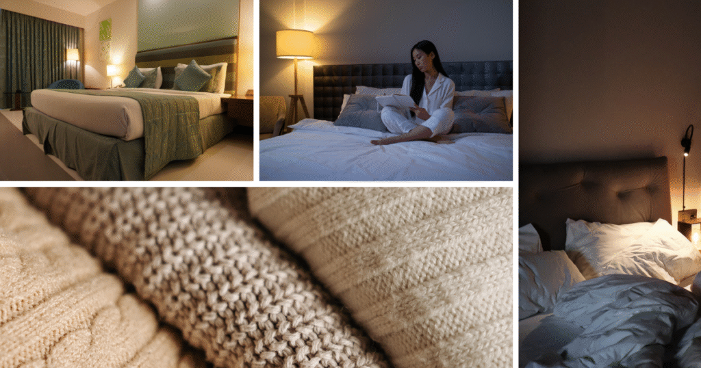
Neutral Cozy Fall Color Palette
This one is my personal favorite among other fall color palettes. You know, sometimes it is the softer tones that make a space or outfit feel calm and lived in.
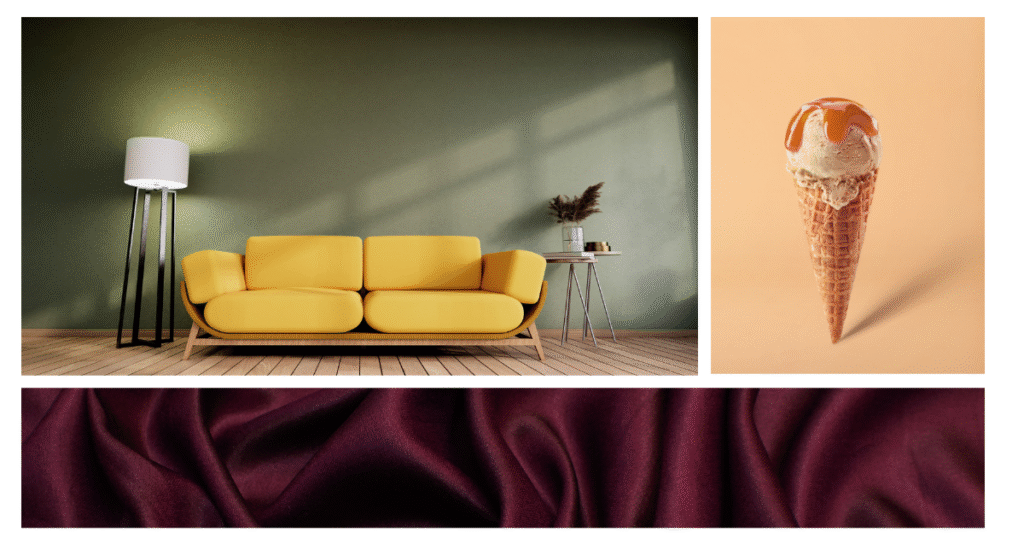
Bold & Playful Fall Color Palette
Sometimes you need colors that bring energy into a space or outfit. Bold tones can be playful without feeling out of place, and they keep the season from slipping into all browns and beiges. This fall color palette proves fall can be cozy and exciting at the same time.
Family-Friendly Autumn Colors
This fall color palette happens to be the kind of palette that people love saving to Pinterest boards, because they bring warmth into both the home and the season’s memories. They look good in a dining room, in seasonal crafts, and even in those family photos that end up pinned and shared.
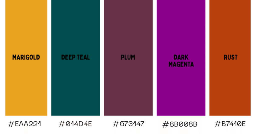
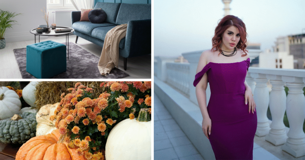
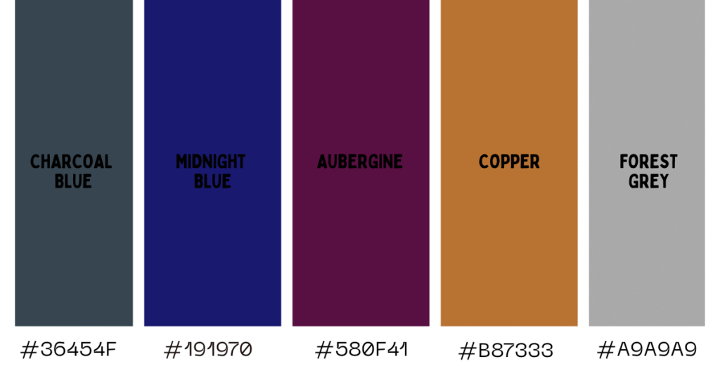
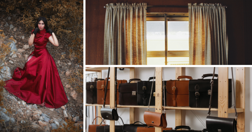
Moody Autumn Nights Palette
As I said earlier, fall is not just about golden afternoons. There is also the side of the season that belongs to quiet evenings, glowing candles, and nights that feel a little more mysterious. This fall color palette leans into depth and drama, bringing elegance to both home and wardrobe.
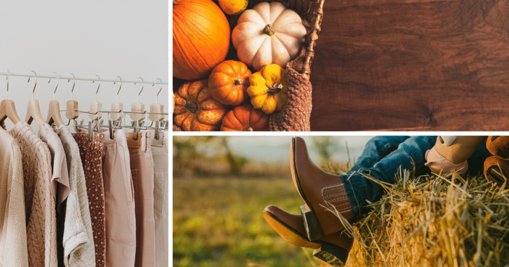
Earthy Harvest Palette
This fall color palette takes its cue from markets, fields, and everything that makes fall feel grounded. It is warm, textured, and perfect for homes and wardrobes that lean natural and rustic.
Pumpkin Spice Palette
Some fall colors are all about fun. This palette is festive, cozy, and inspired by coffeehouse vibes. It is playful enough for casual wear but still warm enough for home accents.

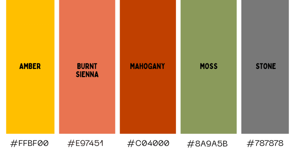
Fallen Leaves Palette
Shades that mimic the ground covered in crisp leaves — the kind you hear crunching under your feet on chilly walks, scattered in layers of amber, sienna, and moss. These colors carry that ‘fall under your shoes’ feeling and bring the same cozy, lived-in texture into your home and outfits.
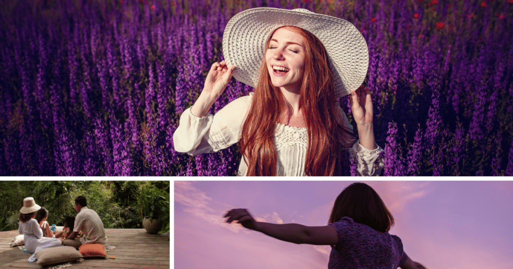
Orchard Harvest Palette
Inspired by apple picking and fruit stalls — the baskets stacked high with red and golden fruit, the scent of mulled cider in the air, and the rustic charm of markets that make fall weekends feel special. These shades carry that same warmth into your home and your wardrobe.

")
How to Mix Fall Color Palettes in Everyday Life
Start with a simple ratio to ensure colors don’t clash. Use the 60 30 10 rule. Sixty percent as your primary color, thirty percent as a support, and ten percent as an accent. It works for rooms and outfits alike. [1]
Pick one method from the color wheel and stick to it for a space or a look. For calm results, choose analogous colors that sit next to each other, like olive, sage, and moss. For a pop of color, pair complementary colors across the wheel, such as teal and copper. [2]
Test colors under your real lighting. Bulb temperature and CRI change how paint and fabrics read. Warmer bulbs make colors feel richer. A high CRI helps colors appear more natural [3]. Try samples in the morning, afternoon, and evening before you commit.
Create a small capsule for the closet to make mixing feel easy. Start with two or three neutrals as your base, then add two complementary colors and one accent color to enhance the vibrancy of your photos and gatherings. This setup keeps outfits cohesive without feeling strict.
Create moodboards to see the mix before you buy. Make one board for the living room and another for the wardrobe. Keep boards focused, name them clearly, and refresh them often. Boards that stay active tend to get more engagement. Aim for at least twenty pins per board.
Tie it together the Hush Homes way. Let your home base carry the 60 percent. Let your favorite wearable shade be the ten percent accent that repeats in pillows, throws, candles, scarves, or a bag. The result feels pulled together, whether at dinner, on the sofa, or in family photos.
My Favorite Thing About Fall Color Palettes
What I love most about fall color palettes is how they never stay in one place. They show up in the cushions on your sofa, in the mugs on the table, and in the sweater you pull on when the air shifts. I am a warm undertone girly, so shades like rust, marigold, and caramel feel like they were made for me. They give that little diva energy while still feeling cozy, and honestly, they look even better in golden light.
You do not have to follow every palette exactly. Pick the shades that feel right to you, mix them into your home or your closet (60-30-10 rule), and let them tell your version of the season. Save the ones you like best, share them with friends, and let fall feel like something you lived in, not just looked at. Follow The Hush Homes on Pinterest for more fall color palettes inspo and simple ways to bring the season into your space and style. And if you’re looking for décor tips to match these shades, check out our Home Decor Guides.
References
[1] https://www.thespruce.com/timeless-color-rule-797859
[3] https://www.olamled.com/what-is-color-rendering-index-cri-and-why-is-it-important/